Gadgets reviews 2025
Maps turn raw data into something visual and tangible. Where do people live? Who do they trade with? Maps are how you reveal patterns that might otherwise go unnoticed. This collection takes you through a range of topics, from the forces driving global economies to how geography influences daily life and culture. These maps tell you where things happen, yes, but if you dig into the geography and history, you can use them to understand why they happened there too.
24. Trade Dynamics
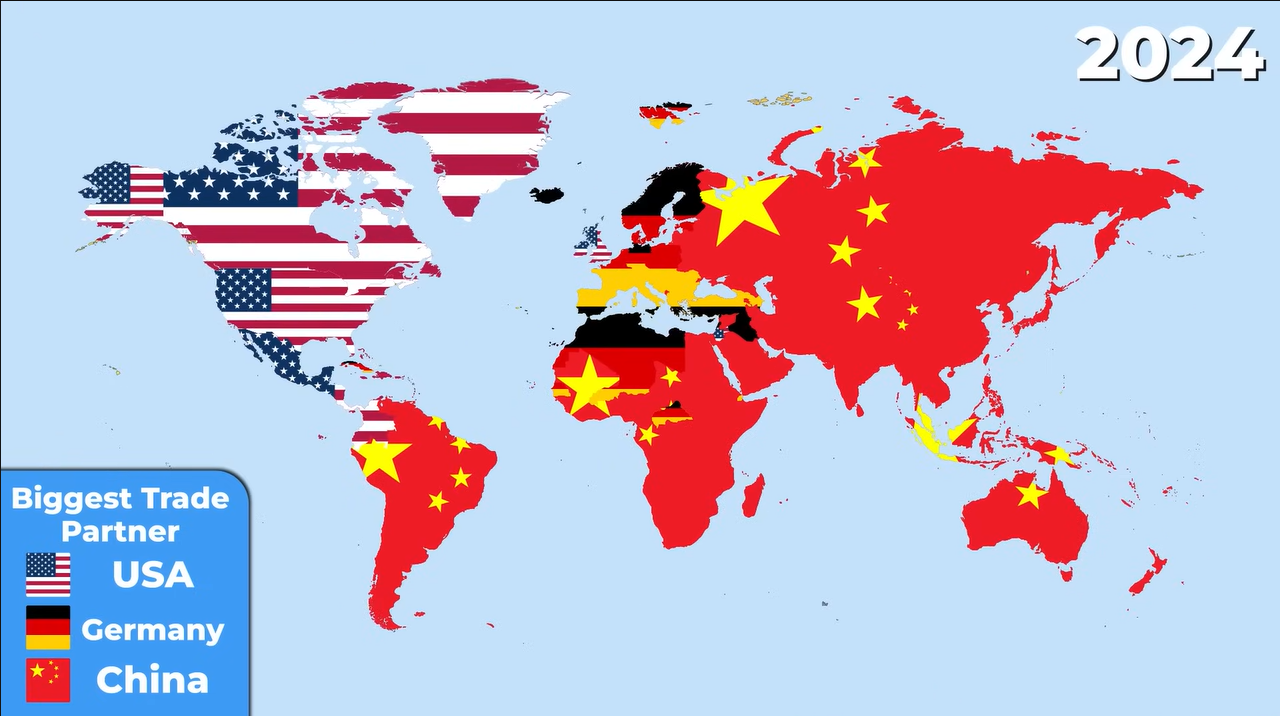
The first map categorizes countries based on their primary trading partners: Germany, China, or the USA. While informative, this map is outdated, reflecting data from 1990. Today, China’s influence has surged, especially in developing regions, while the USA’s trade is more localized. Germany maintains its European market, but it’s unlikely to surpass China’s global reach anytime soon.
23. CO2 Emissions
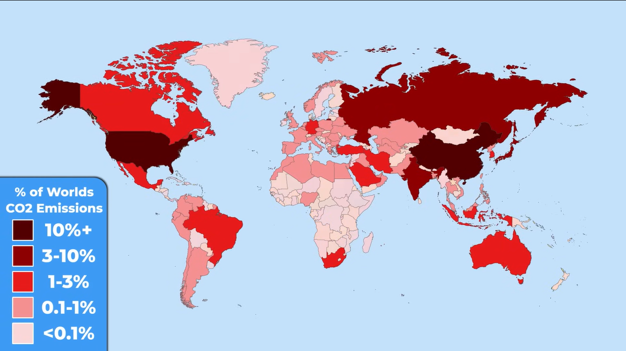
This stark map of CO2 emissions features darker shades to indicate higher pollution levels. China stands out as the largest polluter, responsible for 33% of global emissions, dwarfing the USA’s 13%. In fact, China emits more CO2 than 185 countries combined, highlighting the environmental challenges tied to industrial growth.
22. Population Density

Population density is another critical aspect illustrated in a compelling map. Mongolia, with only two people per square kilometer, is the most sparsely populated country, while Bangladesh is one of the densest, with 1,268 people sharing each square kilometer. This stark contrast emphasizes how geography influences living conditions and resource distribution.
21. Birth Rates
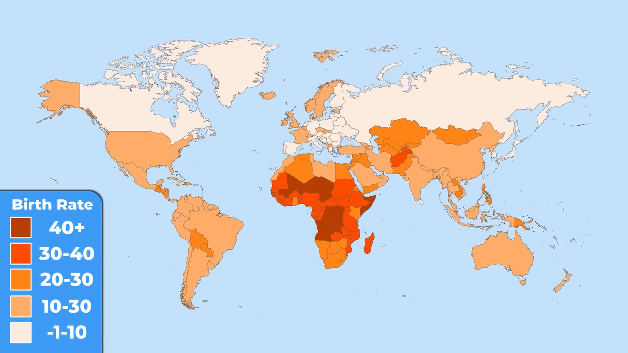
Looking ahead, a map depicting average birth rates reveals that Asia is no longer the leader in population growth. Instead, Africa is experiencing a surge, with Niger leading at a 4% annual growth rate. In contrast, many European countries face negative growth, with Latvia shrinking by 1% each year, raising concerns about future demographic shifts.
20. Hunger Index
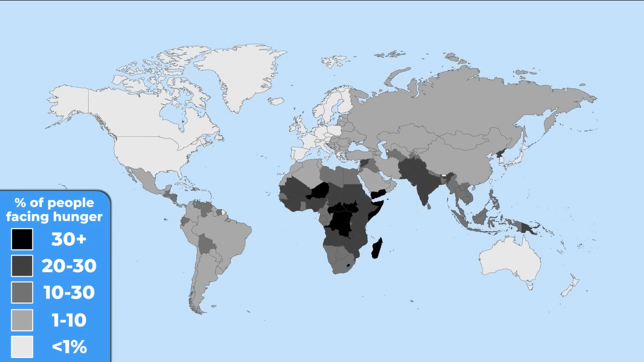
The Global Hunger Index map shows a correlation between young populations and food shortages. Darker areas indicate higher hunger levels, particularly in regions with the youngest demographics. However, it’s worth noting that the situation has improved over the past two decades, showcasing progress in addressing global hunger.
19. Life Expectancy
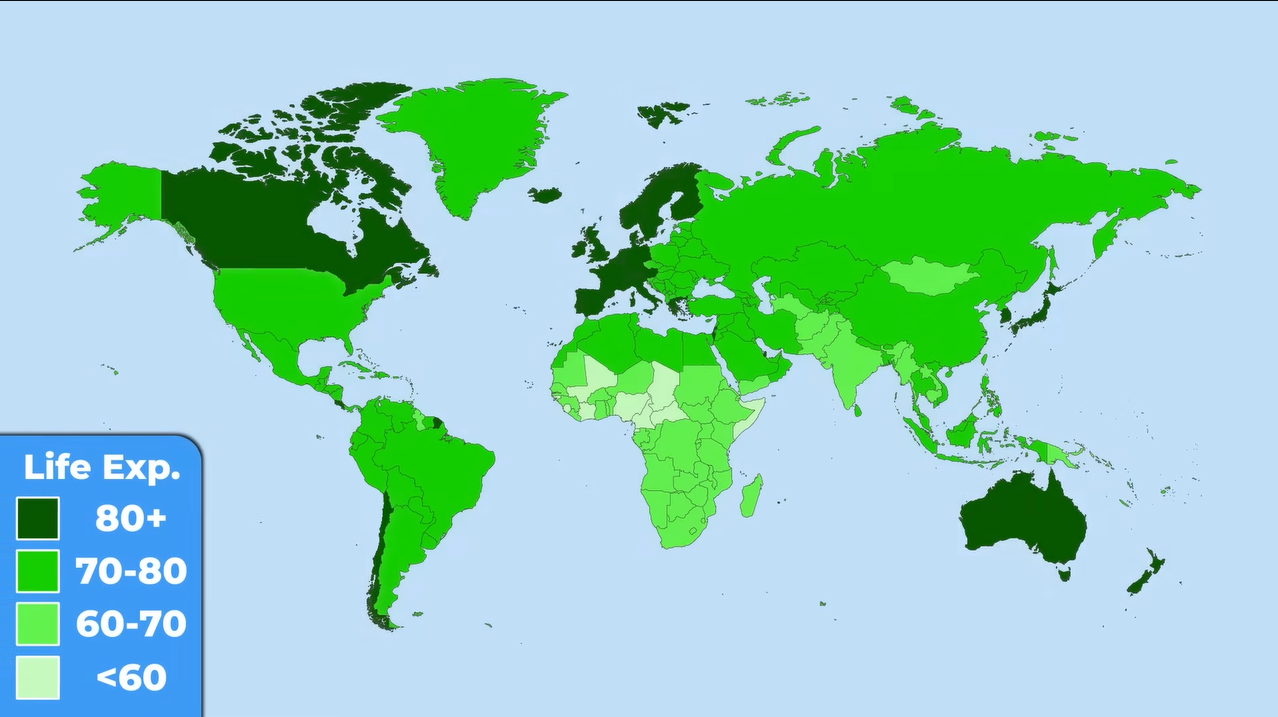
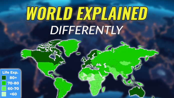
Life expectancy varies significantly across the globe, with Japan boasting an average of 84 years, while countries like Chad and Nigeria hover around 52 years. This disparity highlights the impact of socio-economic factors on health and longevity, revealing a stark contrast in living conditions.
18. GDP and Life Expectancy

The relationship between GDP and life expectancy is nuanced. While wealthier nations generally enjoy longer lives, some countries with high GDP, like India and Brazil, struggle with lower life expectancies. This suggests that wealth distribution and access to resources play crucial roles in determining health outcomes.
17. Corruption Index: A Barrier to Progress
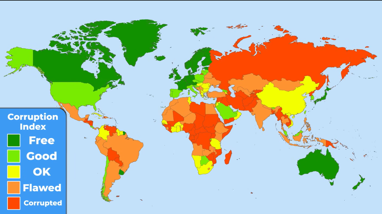
The corruption index map illustrates the varying levels of corruption across the globe. While Western Europe tends to be less corrupt, many countries in Asia and Africa face significant challenges. Corruption can hinder economic growth and exacerbate inequality, making it a critical issue for development.
16. Political Freedom: A Global Snapshot
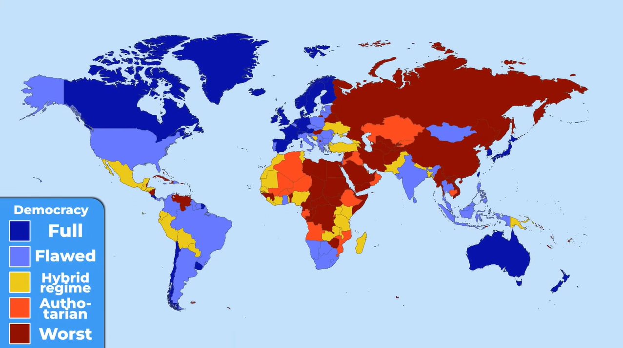
Political freedom is another essential aspect depicted in a map showing the most and least democratic countries. Authoritarian regimes, such as those in North Korea and Venezuela, limit citizens’ rights, while some corrupt nations maintain a semblance of democracy. This map underscores the importance of governance in shaping societal conditions.
15. Peacefulness: A Measure of Stability

The map of peacefulness reveals that Europe is the most nonviolent region, while parts of Asia and Africa continue to experience conflict. Countries marked in dark blue are the most peaceful, highlighting the importance of stability for societal well-being.
14. Religious Distribution: A Cultural Lens

Religion plays a significant role in shaping cultures worldwide. The map shows Christianity dominating in the Americas and Europe, while Islam is prevalent in North Africa and the Middle East. Understanding these religious distributions helps contextualize cultural practices and societal norms.
13. Gender Ratios: A Global Perspective
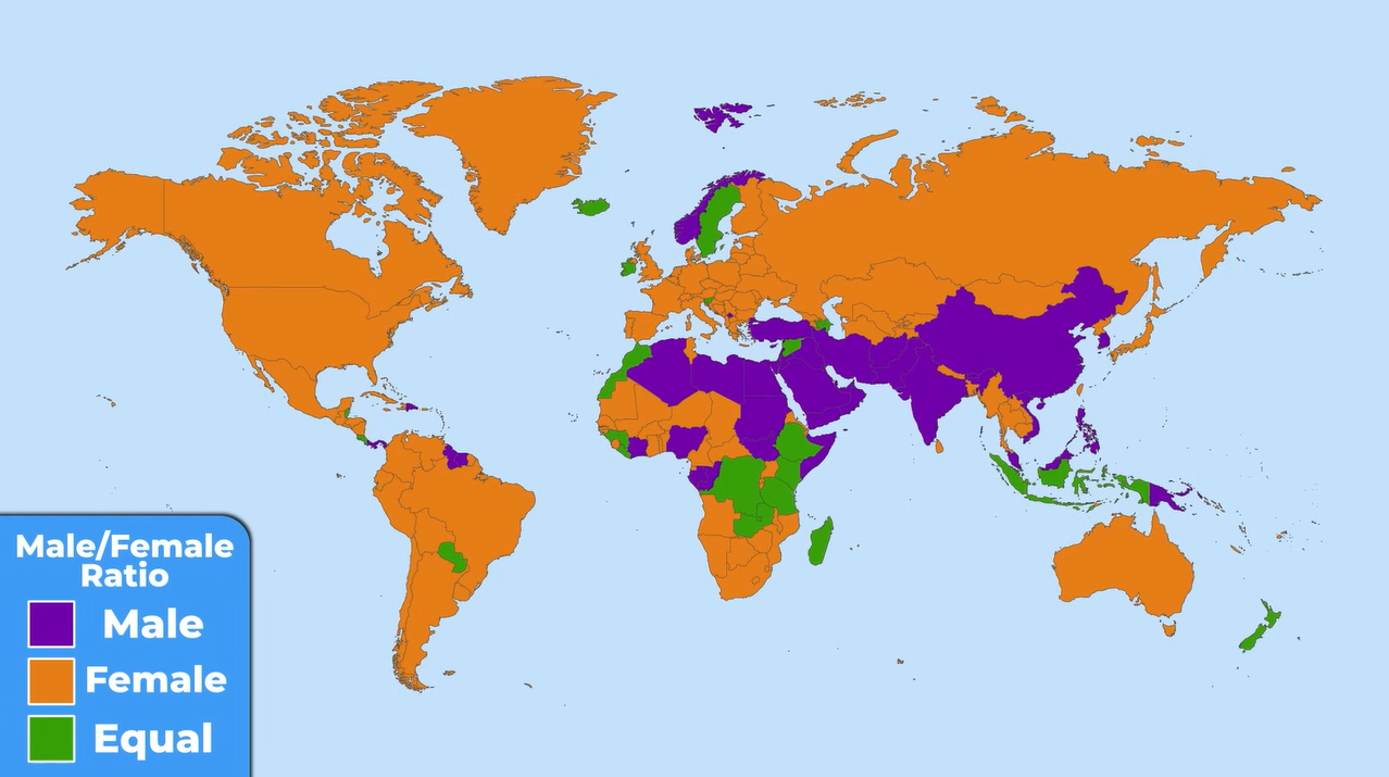
A fascinating map illustrates the gender ratios across countries, revealing that some nations, like Qatar, have a significantly higher male population due to labor migration. This demographic imbalance raises questions about social structures and gender dynamics in these regions.
12. Hair Color Distribution: A Unique Insight
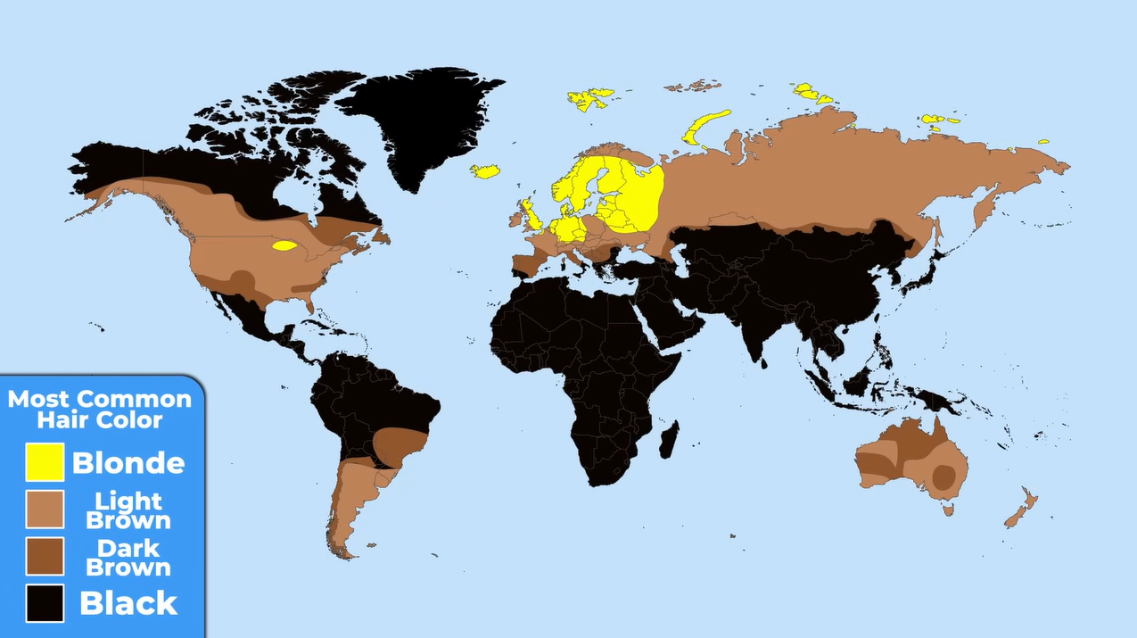
The natural hair color map provides an intriguing look at global diversity. While dark hair is predominant worldwide, northern Europe stands out for its blonde-haired population. This map serves as a reminder of the rich variety of human traits across different regions.
11. Height Variations: A Global Comparison
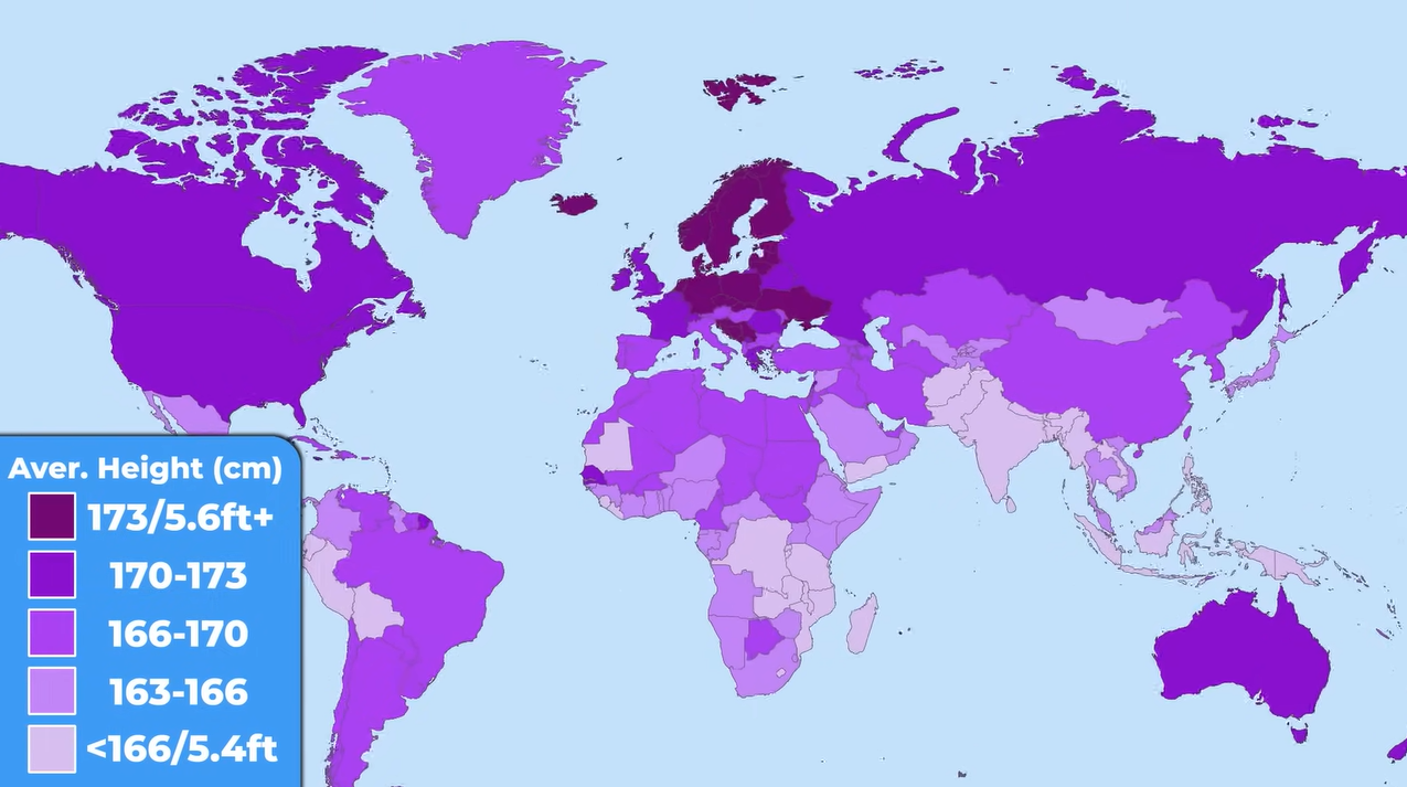
Height differences are starkly illustrated in a map showing the tallest and shortest populations. Countries like the Netherlands boast an average height of 176 cm, while nations in Southeast Asia, such as Guatemala, average 157 cm. These variations can be attributed to genetics, nutrition, and environmental factors.
10. Obesity Rates: A Growing Concern
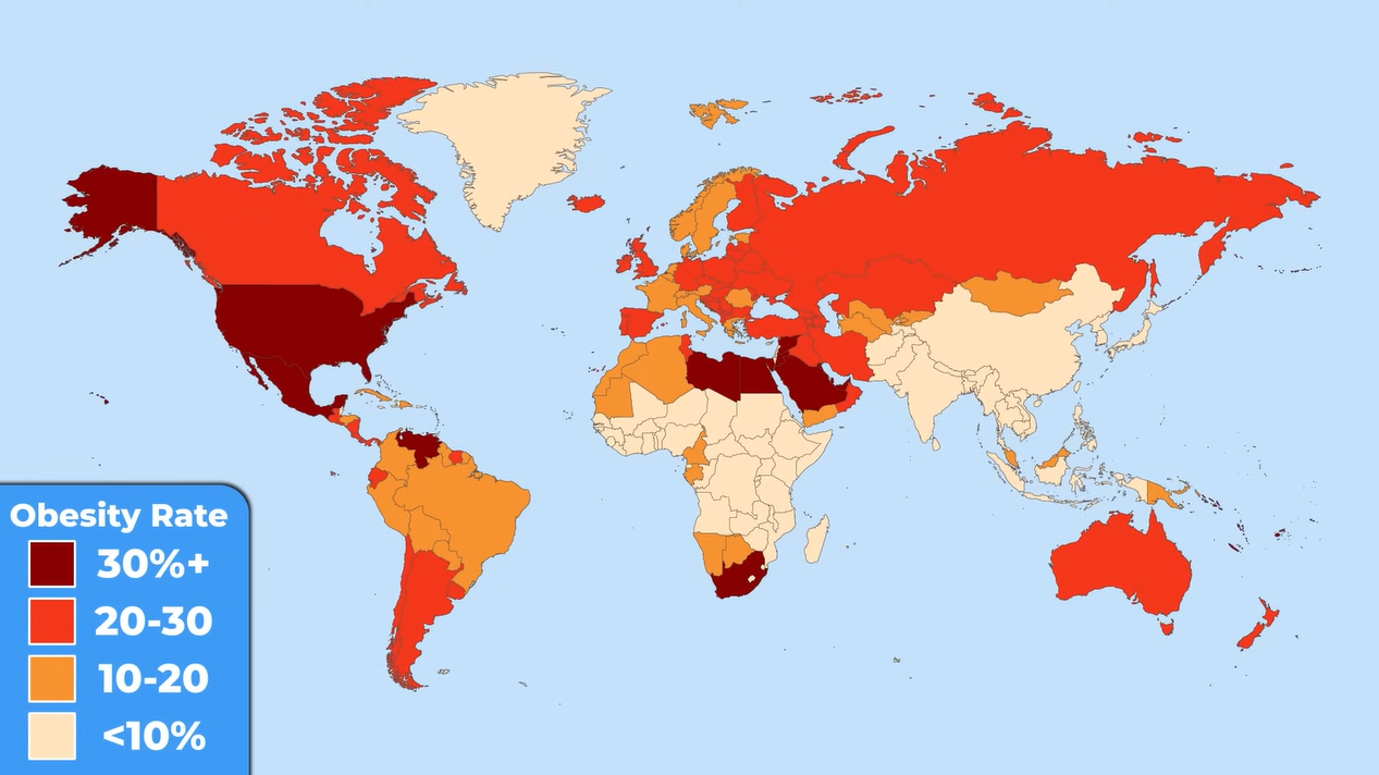
Obesity is a pressing issue, particularly in the USA and parts of the Middle East. The map highlights countries where over 30% of the population struggles with obesity, emphasizing the need for public health initiatives to address this growing epidemic.
9. Literacy Rates: A Global Challenge

Literacy remains a significant challenge in many parts of the world. The map shows that while literacy rates are improving, substantial gaps persist, particularly in Africa and some Asian countries. Access to education is crucial for empowering individuals and fostering economic development.
8. Geography’s Impact: Deserts and Mountains
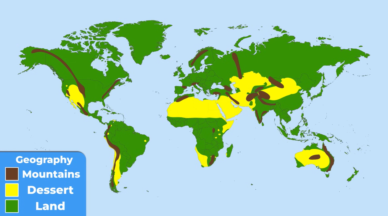
Geography plays a pivotal role in shaping human settlement patterns. The map of deserts and mountain ranges illustrates how these natural features influence where people live, often leading to sparse populations in harsh environments.
7. Climate Zones: Temperature Variations
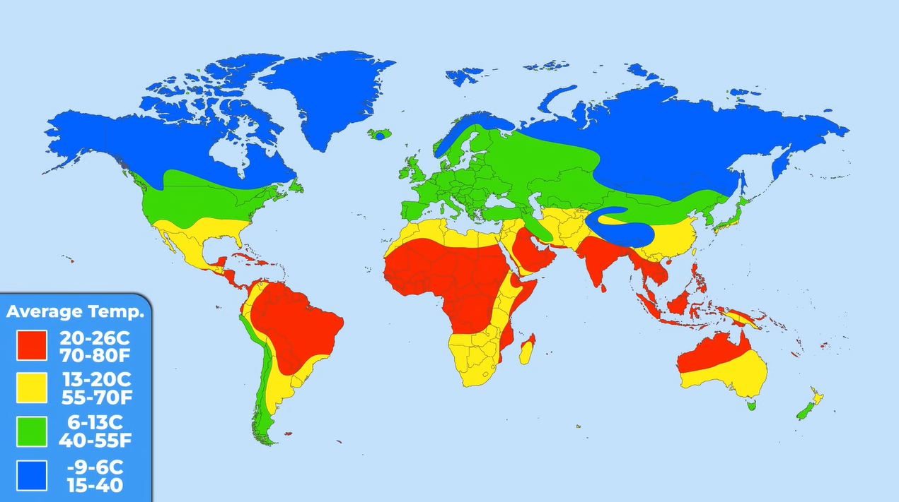
The average annual temperature map reveals stark contrasts between tropical and temperate climates. Understanding these temperature variations is essential for grasping how climate affects agriculture, biodiversity, and human habitation.
6. Travel Safety: A Global Perspective
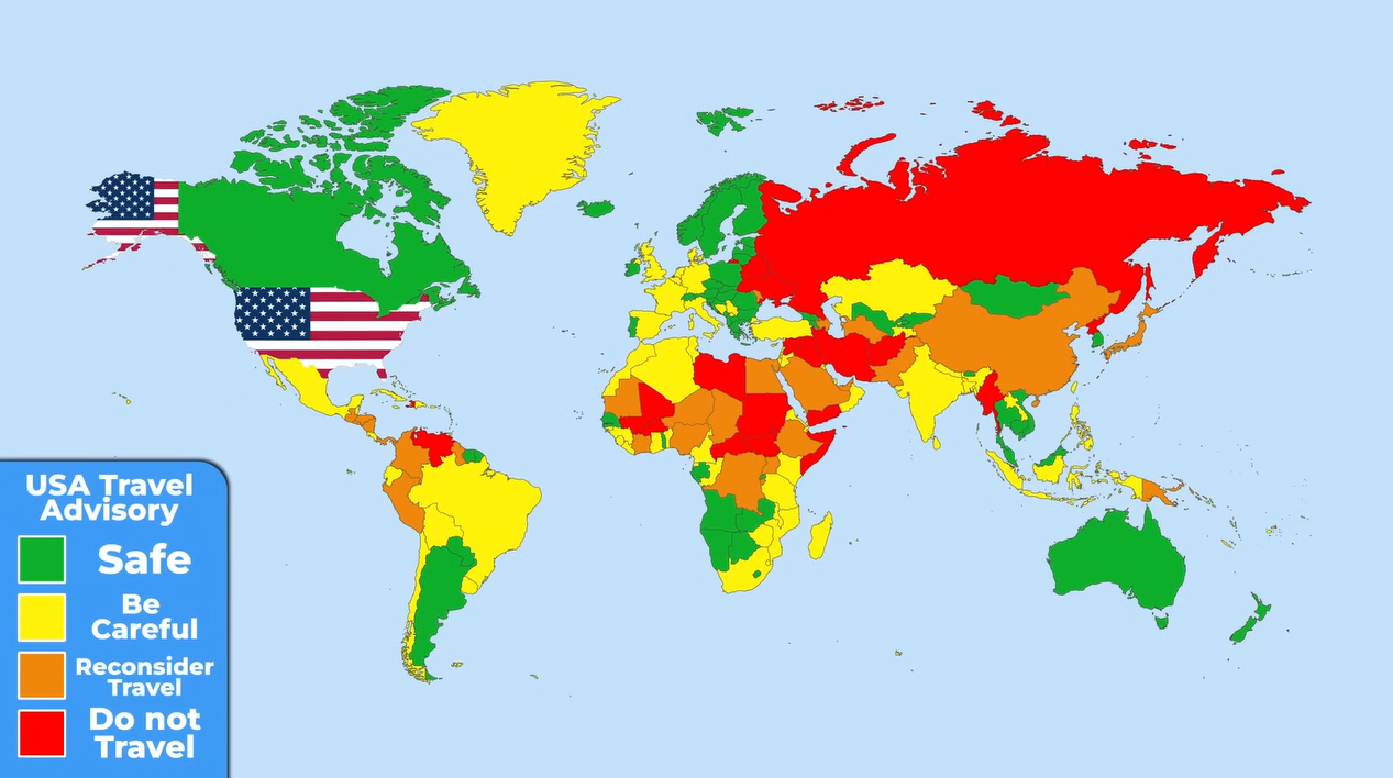
A travel advisory map from the US government categorizes countries based on safety. While green countries are safe, yellow and orange ones require caution, and red countries are deemed unsafe. This map serves as a practical guide for travelers navigating global risks.
5. Tourism Hotspots: A Global Ranking
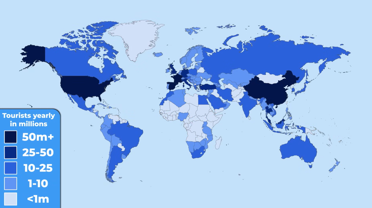
The map of tourist destinations shows that France attracts the most visitors, followed by Spain and the USA. Understanding these trends can help countries develop strategies to enhance their tourism sectors and boost their economies.
4. Language Proficiency: A Communication Tool
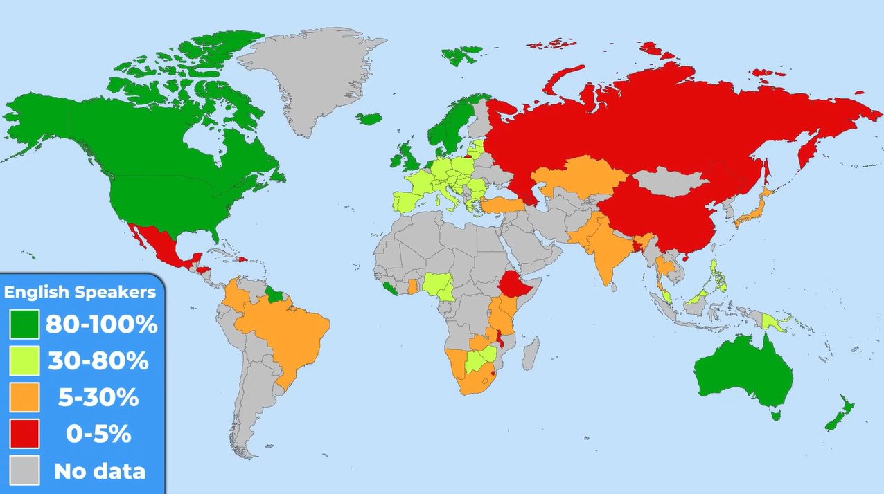
The map of English speakers highlights the importance of language in global communication. While English is widely spoken in Europe, other regions may present challenges for travelers, emphasizing the need for language skills in a globalized world.
3. Language Learning Trends: A Global Snapshot
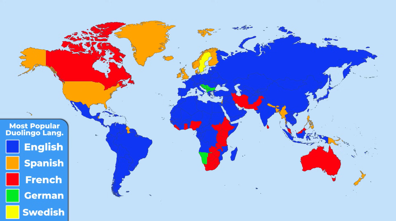
Duolingo’s language learning map reveals the most popular languages being learned worldwide. English leads the pack, followed by Spanish and French, showcasing the global demand for language skills in an interconnected world.
2. Driving Norms: A Global Comparison
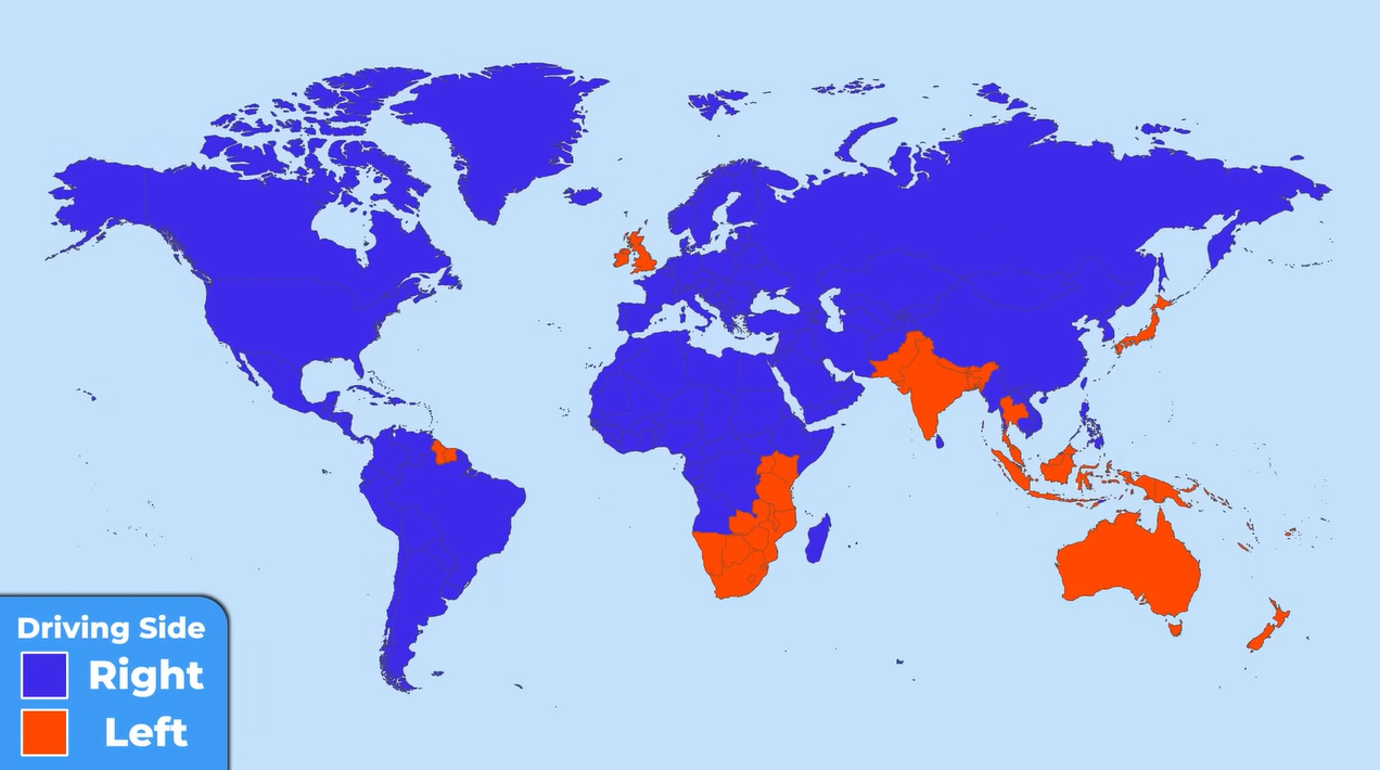
The map depicting driving norms shows that while most countries drive on the right, 75 countries opt for the left. This surprising statistic highlights the diversity of practices that exist across the globe.
1. Newest Countries: A Historical Perspective
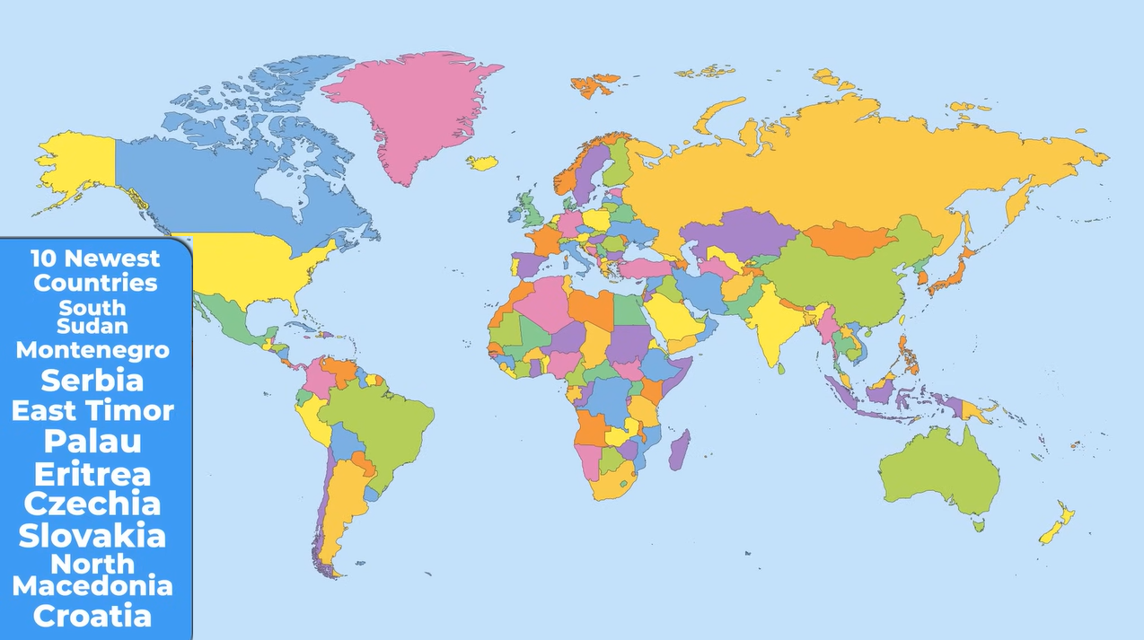
Finally, we explore the newest countries in the world, with South Sudan being the most recent, gaining independence in 2011. This map provides insight into the ever-evolving political landscape and the historical context of nation-building.

